Technical Basics
Understanding Website Structure

YOU’LL LEARN:
- About the main structural areas of a site
- How to sketch out your site’s main pages
- How to select the right colours
When using WordPress, you can pick from a whole range of website designs, or themes, to establish the look and feel of your site. When you pick and install a theme, you are deciding on both a basic design and also a basic structure for your site.
In this article, I’ll show you some of a site’s main elements, to help you to plan out how you want your website to look. Generally speaking, sites all contain some basic elements.
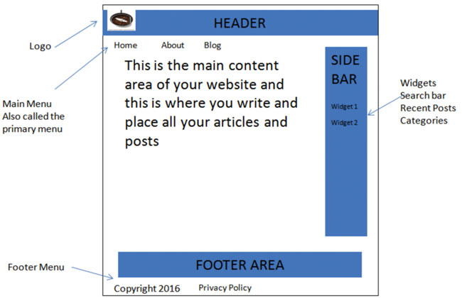
A website normally has a standard size of 1024 pixels wide by 768 pixels. That certainly used to be the case, but as so many different sizes of device are now used to look at websites, this standard size really no longer applies. Your theme’s description will indicate what size it is and typically, you’ll have a content area width of 760 pixels and a sidebar width of 300 pixels. Have a look at a basic website structure below.

Most websites have a header area, a footer area, one or two sidebars, menus and a content area. Now, of course, not every website will look like this – but the main elements will be similar. Let’s have a look at those so as you can get a better understanding of what each part is used for.
The Header Area
This is the very top part of your website. Typically, you’ll find a logo there that represents your brand. Many website owners include a graphic that shows people what their website is about, then add copy to this graphic to explain the main purpose of the website. Some website owners prefer not to have a graphic and just have text there.
Others have sliding images that change to show what is available on their website. It’s a question of personal taste. If you decide on a graphic, then you’ll be able to find out what size the header graphic should be by clicking on Appearance > Customize and then Header. Just be aware that some themes do not support a header at all.
Footer Area
This is an area where you typically display copyright notices, add widgets, and tailor content to your needs. Your footer options are very much dictated by your theme. Some themes will allow you to have a Footer Menu; if yours does, this is an appropriate place to house your legal pages.
Sidebars
Some websites use sidebars and some do not. Again, it’s down to personal preference. The most common approach is to have a mix of some pages with no sidebar, and some with a sidebar. You can set this up when creating your post or page on an individual basis. Some websites place their sidebars on the left or right. Some others will have two sidebars – one on the left and one on the right.
Once again, the theme you pick will determine what options you have available. The most popular choice is to have a homepage with no sidebars leading to other pages and posts with a sidebar. This is all governed by how you like to present your information.
Content Area
This is the most important area, as it’s where your content goes and where visitors will focus most of their attention.
Menus
The theme you pick will determine the number of menus you can create. All of them will have at least one main or primary menu, which sits along the top, usually just below the header. This is where you put links to your main pages. Some themes allow a footer menu; you can add other pages there such as your legal pages, copyright notices etc.
Planning Your Own Website
Grab a pen and paper and sketch out how you want your website to look. Look at your competitor’s websites and see what they do. Look at other websites and figure out how the elements you like can be incorporated into your own site. This may take a few attempts, but it’s worth the short amount of time it takes to do.

For an Amazon Associates website, there’s no right or wrong way to design it. The one thing you need to be certain of is that when you have your own design sketched out, the theme you choose will allow you to have that design.
For example, if you want a sidebar on the right, does the theme allow you to have that? If you want a header graphic, does the theme support it? If you’d like both a header and a footer menu, does the theme allow you to do both?
My Own Personal Preferences
I’ve built quite a few Amazon Associates websites and tested and tweaked different designs. The one thing I’ve learned is my content is the most important thing. Anything that distracts from it is a bad thing and will lose me potential earnings. It’s all too easy to get carried away with adding fancy graphics, lots of widgets like calendars, images, flashing adverts etc. I’ve done this in the past, and it proved to be a big mistake.
If a visitor types in “What is the best grinder for a French Press,” that is what they want to find – they don’t want to be met with sliding headers, flashing images on the sidebars and a website filled with adverts.
They simply want to know what grinder is the best to use with their French Press. Even though all of the graphics etc may look attractive on their own, more often or not, they’re just a distraction. Keep the design as simple and as professional as you can.
Here’s a link to an article on my website, and as you can see, it looks clean, with very few distractions for the visitor. You’ll notice when you look at the article that the content is the most important thing on the website – the article has clear headings, a white background, images and a video all designed to answer the visitors’ questions. You’ll also notice at the bottom of the article are other related articles.
Web Design Principles
When considering your design, do what the experts do, as they know what works. They know how to use space, layout, colours and fonts. Your font should be the same throughout your website.
Use colours to highlight, but never go crazy with a lot of different colour schemes. Whichever colours you pick, keep them consistent throughout your website. Use images, but think about where they should be placed and what size they should be.

Easy navigation for your visitor is essential. It’s said that a visitor should be able to find any article on your website with no more than two-to-three clicks. Avoid long paragraphs as they are dull and very hard to read on a screen.
I have looked at the websites of many beginners and I see this mistake repeated time after time. Paragraphs should be no more than three-to-four sentences. Avoid clutter at all costs and allow your visitor to be drawn to the information they’ve searched for.
Page And Post Design
Later in the case study, I’ll be adding pages and posts to my website. I also like to quickly sketch those out and normally use a whiteboard to get a sense of how I want them to look. When you get into the process of writing your articles, it’s all too easy to forget basic design principles.
Sketching out the layout and general feel of each article really helps, and takes less than a minute to do. When you get used to adding articles, this becomes a habit and you’ll no longer need to sketch them out.
Conclusion
Sometimes, it’s a good idea to step away from your computer and grab a pencil and paper. Draw out what you’d like your website to look like. You can tweak it, of course – just get a sense of what you want the feel to be. Think of colours that are best suited for your topic. For my case study on my coffee website, the colours brown and cappuccino are ideal – I don’t need more than two or three colours.
If you have a gardening website, then a couple of shades of green is ideal – not 40 shades of green. All you need is a basic general look and feel to your website – it will help a lot when you start adding your content. Making these decisions about structure early on will also help you choose a theme that will allow you to have your website looking the way you want it to look.
